Design systems have always been around. In the past, these were usually called pattern libraries, piles of reusable UI components aiding app development, making things faster and easier to set up. There are usually no design principles and guidelines when using these libraries; you are free to do whatever you want or like.
In 2014, when Google released Material Design, it became much clearer what a design system is. It had principles and guidelines for a good approach to creating atomic web components. Today, many companies realize they need to have consistent design patterns across all of their products.
Being a collection of reusable UI components, ranging from atomic to broader level, a design system goes beyond that. It adds structure, meaning and business branding when components are put together to create a product.
FRI:DAY, in its quest to be unique, needed such a scalable system, and this is one area where Makers’ Den expertise came in handy. We implemented scalable design atoms, organisms and components from scratch, following concise specifications from their design team.
Key Technologies
Here is a list of the key technologies we used while creating this project, why we chose them, and their benefits:
React, Typescript
It was always going to be the two above, as they are the key technologies used at FRI:DAY across their Software Engineering team. Typescript gives us static type checking out of the box, the ability to capture errors during the development stage, and a great developer experience right inside the editor.
With Typescript in your tool chain, you can always refactor your codebase without worrying as it will guide you. Also, a typescript project is self documented, it is easier to navigate and think around a project implemented in Typescript.
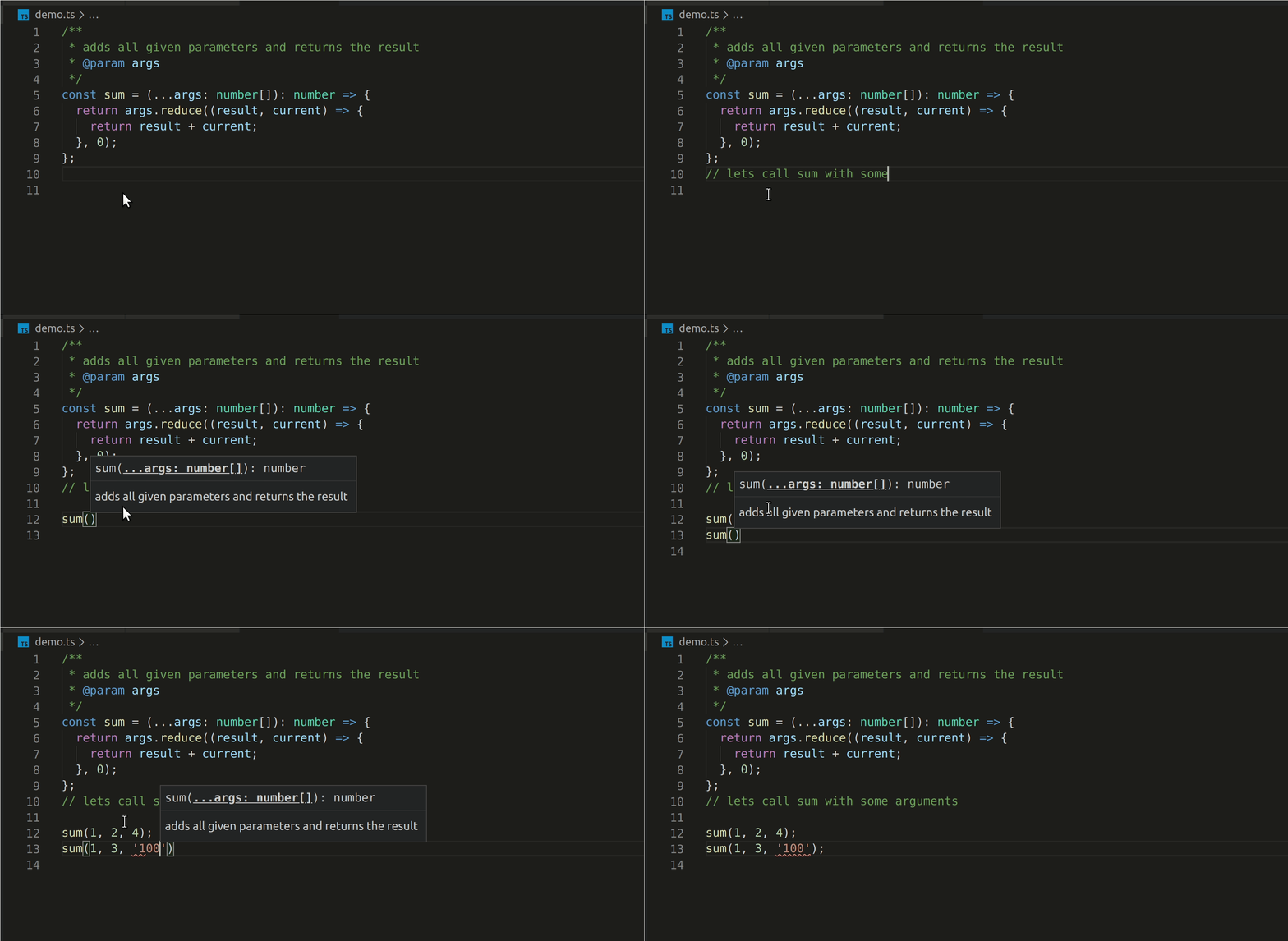
Below, you can see a good example of how typescript helps one to quickly catch errors in development time with excellent error hints. Here, it complains because the sum method only expects number arguments. '100' is not of type number but of type string.

Styled Components
For the last 2-3 years, styled-components has evolved into the leading css-in-js library. Here are some of the key reasons we like styled-components:
Non-conflicting Component Style and Reusability
Styled components generates unique class names for your styles, hence, there is no point worrying if you are going to break existing styles in your application. This is a great thing when compared to the old way of styling applications, where one either resort to inline styles or to using some class naming conventions such as BEM style, etc.
This unique naming style, means that your react components are bulletproofed and can be reused anywhere in your application without worries.
Critical CSS & Server Side Rendering
Styled components supports server side rendering. It will also only inject the necessary css for the rendered components, making your website initial load speed a joy. That is to say, when a component is not rendered on the page, none of its css gets injected.
Testability - Jest with Styled Components
We can also test our styled components, using jest-styled-components. It provides matchers that makes testing styled components easy.
State & Dynamic Styling
We can adapt component styling to the components current state and props. This makes it a lot easier to achieve many of the state adaptive stylings that would be tedious to implement using regular sass or react css modules.
Below is an example of adapting styles based on props, the font-size of the TextField changes based on the selected font-size:
Styled System
To make things more dynamic and flexible, with responsive styling out of the box, we integrated styled-system into the project. Styled system is very powerful, flexible, and api driven.
With Styled System, achieving media responsive design, while laying out atomic design principles such as spacings, sizings, colors and layouts is made a lot easier.
Styled System allows you to define custom media breakpoints for your application, and then, you apply styles that can target a given device breakpoint or range of breakpoints. There is not much required in integrating styled-system with styled-components. All that is needed is to import any of the desired styled-system api functions and use in your styled components.
Below is an example of how this works:
This example above shows how you can easily achieve responsive styling without doing repetitive media queries. The styled-functions imported above takes care of this automatically. Oh and of course, you have to tell styled-system your device breakpoints, spacing specs and other needed values using styled-components' ThemeProvider.
React Storybook
There is the need to visualize and document all ui components we created. A platform, ideally should be hosted all in one place, a go-to location where stakeholders, software, design and content teams can quickly see all the ui components in their visual state, and can interact with them, read usage notes, and possibly view usage samples.
This, we achieved using React Storybook. All these are made possible in storybook, with tons of addons for advanced features. Whenever there is a release, there is an associated production build of the storybook ui, which automatically gets deployed and hosted in AWS S3, making the whole process seamless for all stakeholders.
UI Testing - Babel, Jest, Jest-styled-components, Enzyme
Tested code gives confidence, it is self documenting, it has zero to few edge cases or bugs, it gives room for code refactoring, and many more. We used Jest, one of the leading test framework in the Javascript ecosystem.
Note: When writing tests, always make sure that your test case fails.
Along with jest, we setup Enzyme to help us in testing our react components in details, such as react synthetic events and component states, render calls, and component prop assertions.
To test our styled components, we also needed jest-styled-components, a plugin that makes snapshot testing of styled-components way easier, and also provides the toHaveStyleRule matcher, that you can use to assert that certain styles are applied to your components.
Note: Snapshot testing is an easier way to visualize any changes made to the code, but that should not stop one from testing the actual component implementations and or behaviours.
Library & Assets Build - Rollup, Tree Shaking
After all said and done, it was very important that the final product build is optimized, supports tree shaking, and should be available in all major build formats, such as commonjs, esm and iife.
To support tree shaking, web asset bundling tools such as webpack and rollup all requires that you have an esm build of your project, then you need to specify the entry path to the build in your package.json file using the module property. This, you can see in design libraries like material-ui and many others.
For us, We utilized rollup-all, a tool developed by one of our engineers to run all of our build process. Rollup-all utilizes Rollup JavaScript API to automate library build process, generating both commonjs, esModules and browser builds in one go.
Versioning, Semantic Release and NPM
All versions of the project are hosted in Friday's private npm repository. A gitlab pipeline job runs on the master branch, and with the help of semantic-versioning and conventional commit messages, the process is automated.
Check out these node modules: Semantic-release, cz-conventional-changelog, husky-hooks


