First, Last, Invert and Play - aka FLIP animations. It's a cool technique you can leverage to do smooth animations used in libraries like Framer, and enables animating CSS layouts like flex and grid.
By Korneliusz Caputa
Intro
I made a short video introducing the topic:
If you watched it, you can skip to the code section.
Animations bring an application to life. In my experience they are often underestimated as an integral part of a design. To illustrate to yourself the importance of purposeful transitions, consider that nothing in nature changes state discretely. Even lightning arcs and branches along a beautiful path dictated by conductivity, looking for the easiest route to connect the ground with the sky.
It's a delight to see the contents of an application behave as they would in the real world. Purposefully designed animations also help with usability. They reduce the cognitive load on the user, help avoid change blindness and guide focus to what's important
Problems and solutions
Not all transitions have been created equal. Using a transition on dimensional properties (width, height, margin, padding, top, left etc.) with CSS comes with a penalty, since the browser has to recalculate the layout on every frame. To avoid that, we pre-calculate the transition that needs to happen before the browser has a chance to paint and then let it run smoothly.
To achieve all this, we get the boundingClientRects of the element's initial and final state, apply a CSS transform to it and run the whole thing by applying a transition on the transform.
The steps
A short illustration of how the process goes:
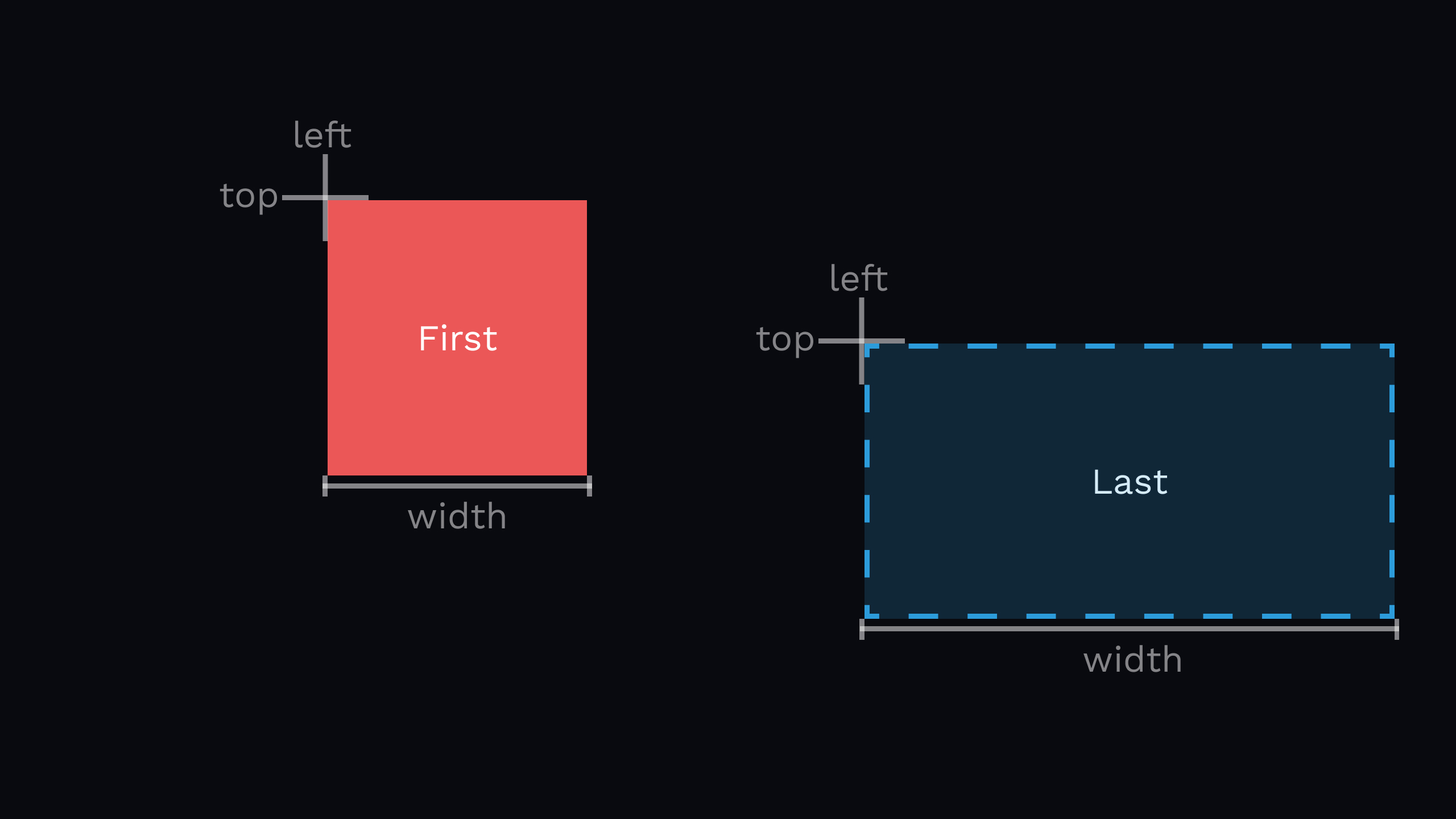
First and Last
The First is the element before the transition and Last is where we want it to go.
We need to store the boundingClientRect of the element and resize and/or reposition it to the target location.
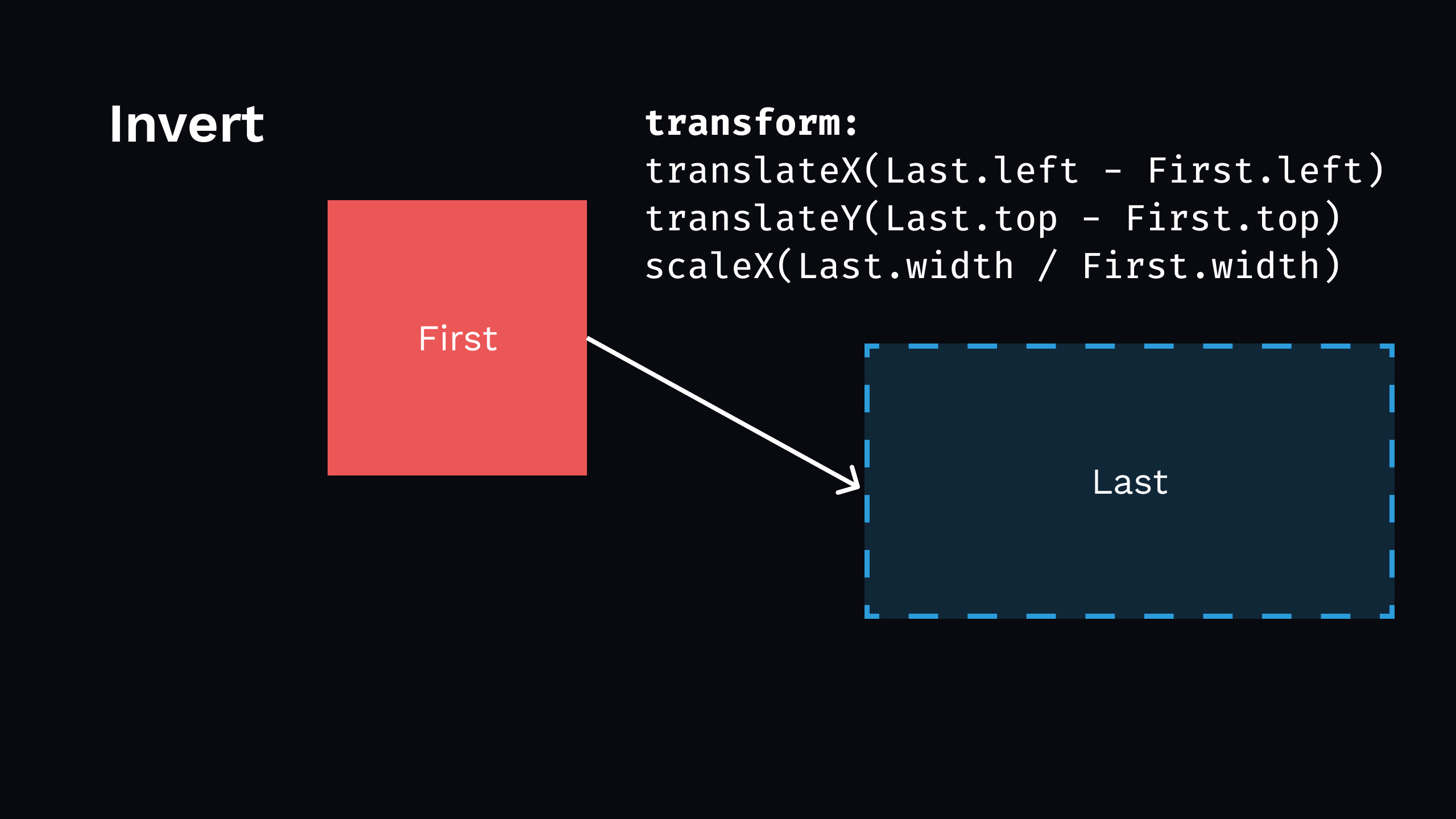
Invert
In this stage, we need to be after browser layout but before browser paint. That means getting the boundingClientRect of the element will give us the information about its final state. We use this to compute the differences as shown.
Play
Finally, we make the element move and let the browser paint.
The element movement can be achieved in multiple ways, e.g.:
useRef returns a mutable ref object whose .current property is initialized to the passed argument (initialValue). The returned object will persist for the full lifetime of the component.
Last
Code responsible for figuring out the Last parameters:
for(const child of children){const next = child.getBoundingClientRect();}
Invert
Code responsible for figuring out the inversion:
for(const child of children){const key = child.dataset.key!;const next = child.getBoundingClientRect();if(key in origins.current){const previous = origins.current[key];const delta =getDelta(previous, next);if(!isZero(delta)){invert(delta, child);}}}
The final piece of the puzzle is controlled by this code:
requestAnimationFrame(()=>{play(child);});
Again, the play function is abstracted since there are multiple ways to go about it. I stuck to my guns with CSS transform because I used that in the invert step.
Note the requestAnimationFrame call in the Play step - we need this so that the Invert applied to the DOM can be processed by the browser. This is necessary if you choose CSS transition as your means of animating.
In case of the Web Animations API or Anime.js , it's not needed. Moreover, you can then roll invert and play into a single function e.g.
The signature is identical to useEffect, but it fires synchronously after all DOM mutations. Use this to read layout from the DOM and synchronously re-render. Updates scheduled inside useLayoutEffect will be flushed synchronously, before the browser has a chance to paint.
You can see how this hook lets you access to the DOM in a perfect moment for the Invert step. In theory useEffect can be used here too, but it's unreliable, especially in situations when things are being added/removed from lists.
Avoiding animation on first render
This depends on the situation and is a matter of personal taste, but usually I don't like things to transition on first render. For me animation must enhance the experience and not slow you down from getting the information you want. An example to the contrary would be a landing page with a beautifully orchestrated opening sequence.
To avoid spurious flailing of things "in the morning" of my list, I used a ref that switches to false after the first processing run.
let firstRun =useRef(true);useLayoutEffect(()=>{constchildren: HTMLElement[]= Array.protoype.slice.call(list.children);for(const child of children){if(!firstRun.current){/* do the flips */}}
firstRun.current =false;},[root, invert, play]);
Calamity!!!
FLIP animation can be a finicky beast - everything is fine and dandy until it isn't.
There is a lot more things to take care of to make it working reliably, smoothly and under edge cases.
So either I describe it all here, doubling the size of this post, or...
Be smart and use tools
My tool of choice for dealing with FLIP in React is react-flip-toolkit . Years ago I worked with react-flip-move as well, but it's mostly focused on reordering lists. It's a no-go if you start resizing things to fit different content for example.
How does the example look implemented with react-flip-toolkit?
Flipper and Flipped are the foundational components of react-flip-toolkit.
Flipper serves as your FLIP animation container. It needs a flipKey prop - make sure that it changes every time you want the Flipper contents to animate!
Flipped wraps the things you want to be animated. Here, the flipId is important. It is the link between the First and the Last, making sure the library knows how the transitions should look like.
The toolkit handles the edge cases I haven't considered in the pure hook solution. (it was a mix of problems, including re-rendering the list while animations were still going and using in-between positions as Firsts)
Closing thoughts
react-flip-toolkit packs a serious punch and covers pretty much anything you may need for FLIP animations in React. It also works with other libraries should you be interested.
Having FLIP in conjunction with other transitions and animations in your toolbelt, sky is the limit in terms of what you can create. Think UX on steroids, beautiful page transitions, morphing shapes, funky text effects etc.
:format(webp))
:format(webp))


:format(webp))
:format(webp))
:format(webp))