:format(webp))
:format(webp))
Why Design Systems Aren’t Just for Big Companies Anymore
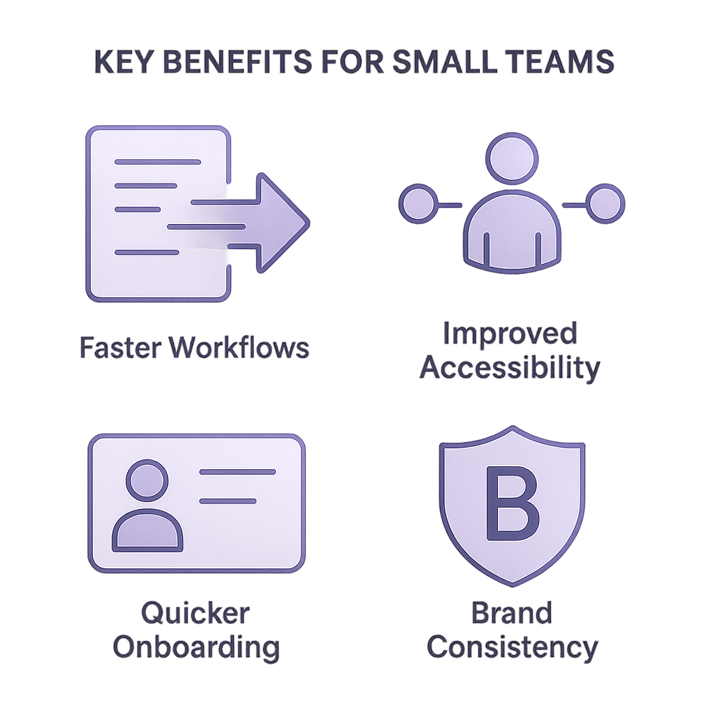
When you finish this article, you’ll know how a design system can transform your small team’s workflow, deliver faster results, and unlock benefits most guides don’t mention—everything from better accessibility to quicker onboarding.
What a Design System Really Is
A design system is more than a UI toolkit. It’s a collection of reusable components, patterns, and guidelines that everyone on your team follows.
Ensures brand consistency on web, mobile, and beyond
Cuts down on “reinventing the wheel” by offering ready-made building blocks
Aligns designers and developers around shared principles
“Design systems are living ecosystems, not static style guides.” – Brad Frost, in his Design Systems 101 article
How a Design System Speeds Up Delivery
Even small teams report dramatic gains when they adopt a design system:
A combined 30% average reduction in design and development time and 35% drop in maintenance costs, according to UXPin’s 2020 Design Systems Report
Faster iterations because the basics are already solved
Metric | Value | Source |
|---|---|---|
Design & Development Time Reduction | 30% | UXPin 2020 Design Systems Report |
Maintenance Cost Reduction | 35% | UXPin 2020 Design Systems Report |
Cutting Design Debt
Every time you duplicate styles or components, you accrue “design debt.” A design system stops that snowball by providing a single source of truth.
Building Your First Design System
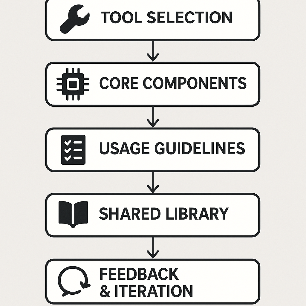
You don’t need a huge budget or a dozen specialists. Follow these steps:
Pick your tool (Figma, Sketch, Studio).
Define 5–10 core components (buttons, inputs, cards).
Write simple usage guidelines.
Store assets in a shared library.
Invite feedback and iterate.
Prioritize for Today
Don’t try to cover every edge case. Start with what your users encounter most often—then expand.
Keep Documentation Lean
A one-page cheatsheet or interactive living document can be more helpful than a 50-page PDF no one reads.
Unexpected Perks You Might Overlook
Accessibility & Inclusive Design
Ensure your buttons meet contrast guidelines and your components include proper ARIA labels. This makes your product usable by people with disabilities and often required by law, as outlined in the W3C WAI Fundamentals of Accessibility Principles .
Rapid Onboarding
New hires can explore your component library instead of digging through scattered files. Airbnb’s Lona system cut ramp-up time for designers by 60%, according to their Medium post on Lona .
Open-Source & Community-Driven Launchpads
You don’t have to build from scratch. Google’s Material Design provides comprehensive guidelines in its Material Design documentation , and IBM’s Carbon Design System offers a robust foundation on the Carbon Design System site .
Fuel for Experimentation
With routine choices automated, your team can focus on novel features and refined interactions rather than pixel-perfect buttons.
Real-World Impact by the Numbers
37% faster development cycles for teams using shared component libraries, as reported in InVision’s Inside Design metrics
A 30–35% cut in technical support costs after rolling out a design system, based on findings from the Nielsen Norman Group’s introduction to design systems
25% increase in customer satisfaction scores when UI consistency improves, according to Salesforce’s Success Metrics blog
Impact | Percentage | Source |
|---|---|---|
Faster Development Cycles | 37% | InVision’s Inside Design |
Technical Support Cost Reduction | 30–35% | Nielsen Norman Group |
Customer Satisfaction Increase | 25% | Salesforce’s Success Metrics |
Your Next Moves
You’ve seen why a design system matters, how to spin one up without a huge investment, and the hidden gains most guides skip. Now it’s time to pick your first five components, sketch out a quick style guide, and invite your team to build something that lasts.
:format(webp))
:format(webp))
:format(webp))