Background
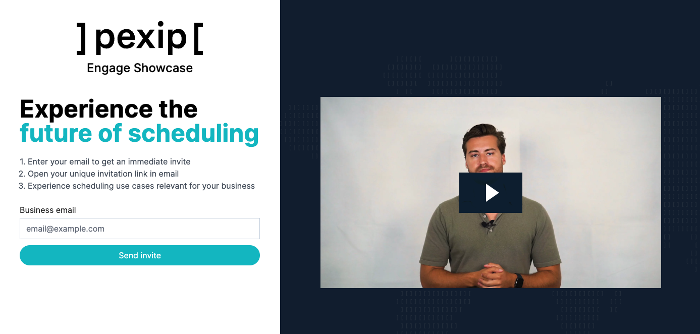
Pexip Engage, the enterprise scheduling sub-division of Pexip, reached out to us in 2022 about creating their new showcase site. Their previous showcase site, which demoed use cases of their enterprise scheduling plugin, hadn’t been updated in years.
:format(webp))
Arne Bassez
VP Pexip
:format(webp))
“I wanted to work with a team that had the same values of quality and craftsmanship to create our Pexip Engage Showcase application. Makers' Den designed, implemented, iterated, and delivered beyond the initial requirements. Great experience overall.”
How we started
Pexip Engage had already worked with us as we implemented the marketing website for their previous brand, Skedify. Happy with the previous collaboration they got in touch again for this new case.
In the initial meetings Arne Bassez, a Pexip VP in charge Pexip Engage, showed us the initial wireframes from which we derived the requirements. After a bit of back and forth to clarify requirements, we produced estimates and an offer which was approved by Pexip.

The technical setup
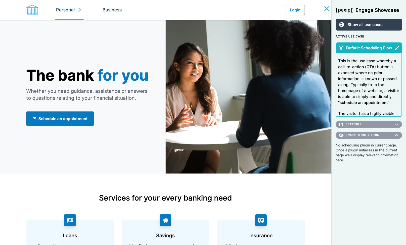
The showcase site was architected like a traditional marketing website, but with top-level folders representing different verticals, i.e. marketing websites within different industries like Banking, Insurance, and Retail.
The core technologies used were:
Typescript - We aim to do everything with Typescript, and it’s what we’re really good at.
ReactJS - The frontend framework of our choice. Usually a central part of all our projects.
NextJS - We don’t like re-inventing the wheel, so leveraging existing ReactJS frameworks is our preference. NextJS was a really solid fit for this case.
Storyblok - Our Headless CMS of preference. It’s great for managing content, usually for marketing websites, but since this showcase was presenting marketing websites, it was a stellar fit.
TailwindCSS - Among the most popular styling solutions currently. It’s also a really good fit for marketing websites due to it having no runtime as most CSS-in-JS solutions do.
How we worked together
We started off with a 2-hour kickoff where the client stakeholder (Arne & Fred) and our team (Igor & Carl) went through all the requirements, by walking through the wireframes.
We set up our weekly sync meeting and created a shared Slack channel for ad-hoc comms. We set the forecasted delivery date and milestones already based on our estimates and the team at hand.
In our weekly sync meeting we would walk through the completed tasks in Asana, and prioritize the tasks for the next week.
The results

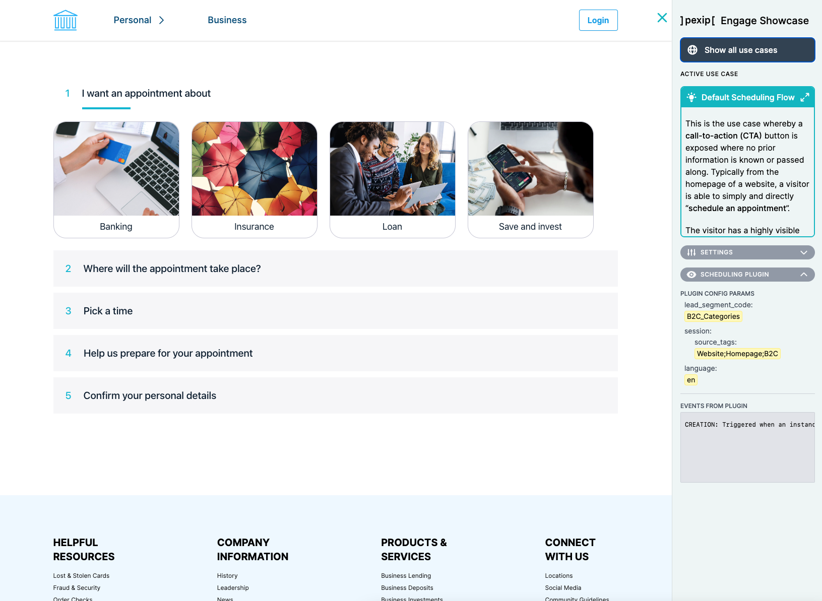
In the context of this project, we created three full-featured marketing websites with different themes and assets, representing three different industry verticals. Each vertical had 15 to 24 use cases demoed. This was made possible due to us architecting everything to be based on a HeadlessCMS, allowing content managers to simply create new pages and use cases by editing content in the CMS, without any development effort.
It’s become an invaluable tool for the sales organization of Pexip Engage, allowing them to do in-person sales with examples relevant to the potential lead. It also allows them to have the customers try out various use cases by themselves, due to it being so easy to use and self-explanatory. It even proved to be valuable to their own developers, as they started using it to test out various scenarios as well.

:format(webp))


:format(webp))
:format(webp))
:format(webp))