Background
Kickflip creates product customizers for leading brands world-wide. Their tools integrate easily with the biggest e-commerce platforms like Shopify and WooCommerce, and they needed a marketing website to match the excellence of their SaaS services. They were looking for an agency with deep knowledge of both Storyblok and ReactJS, and after evaluating a number of the top agencies, they chose to work with Makers' Den. We were picked to build a best-in-class website to power their SEO, performance marketing and lead funnels.
:format(webp))
Renée-Jeanne Ruel
Director of Marketing
:format(webp))
“Thanks to your team who participated to our project. We really appreciated working with you guys. You are doing such a high quality job, everything was well organized, communication was great.... and we still can’t believe how fast everything was done! 🤩”
How we worked together
Kickflip had designs ready and a strong understanding of sectional website designs and page builders - which made this an unusually smooth partnership.
We started off with a 2-hour kickoff where the Kickflip stakeholders and our team went through all the requirements, by walking through the designs and the plan for the page hierarchy. We set up our weekly sync meeting in Google meets and a Slack channel for ad-hoc comms. We set the forecasted delivery date and milestones already based on our estimates and the team at hand.
We started with working on the basic layout, header navigation and footer, and then on the sectional components featured on the home page. By the time we moved to the following page, it re-used a lot of the sections from the previous page. I.e. for each page, the following pages would require less time to produce. At the end there is zero development time for new pages, as one will just leverage existing blocks from you library in Storyblok to build up new pages.
In our weekly sync meeting we demo the implemented pages in a demo environment, and in the context of Storyblok. Afterwards we would prioritize the tasks for the next week.

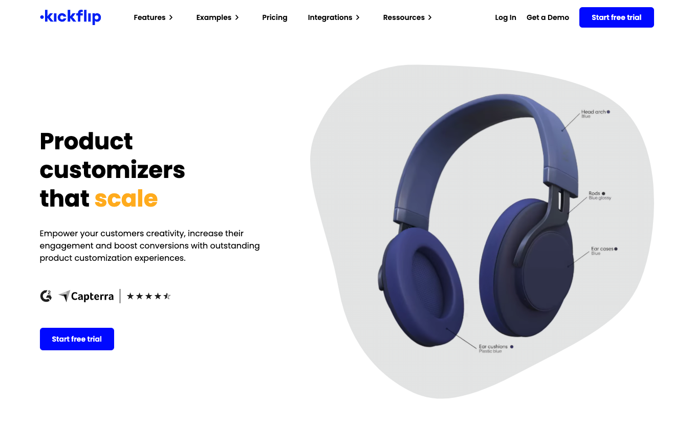
Above the fold on the homepage
The technical setup
The website is architected using best practices for marketing websites:
Content organized in Storyblok in a way intuitive for the content managers.
Support live previews for Content Managers so they can see what their content will look like as they edit.
Intuitive ways to control all relevant technical SEO including page H1, meta title and descriptions and OpenGraph image data
Automatically generate SEO relevant data, like site maps and JSON+LD for breadcrumbs, article metadata, etc.
Easy to create lead pages, with performance marketing setups so the visitor is more likely to convert
Top notch performance with high scores on Core Web Vitals
Best performing GDPR-compliant cookie consent platform setup, integrated with Google Tag Manager, and setup to drive visitors to approve efficient re-targeting/re-marketing
The core technologies used were:
Typescript - We aim to do everything with Typescript, and it’s what we’re really good at.
ReactJS - The frontend framework of our choice. Usually a central part of all our projects.
NextJS - We don’t like re-inventing the wheel, so leveraging existing ReactJS frameworks is our preference. NextJS was a really solid fit for this case.
Storyblok - Our Headless CMS of preference. It’s great for managing content, usually for marketing websites, but since this showcase was presenting marketing websites, it was a stellar fit.
TailwindCSS - Among the most popular styling solutions currently. It’s also a really good fit for marketing websites due to it having no runtime as most CSS-in-JS solutions do.

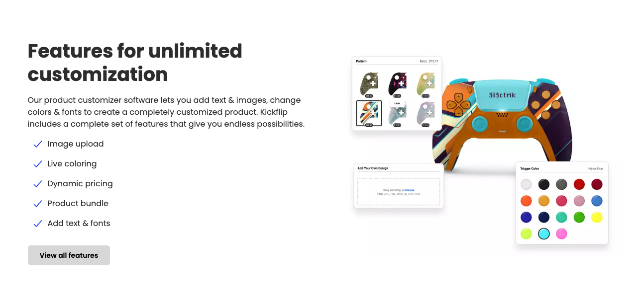
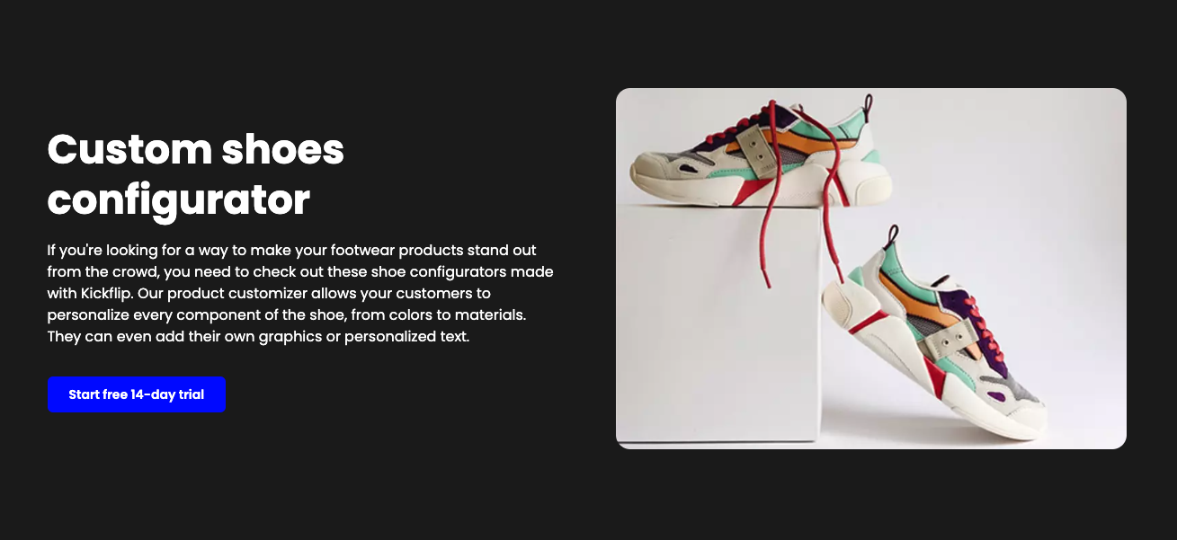
Typical "Split Content Section" where one can choose to put a content on the left and right side, varying the plugged in content between images, rich text or video.
The results
Kickflip launched an industry leading marketing website, with an intuitive content organisation, easily managed by their content managers and marketers, and that out-performs their competitors' websites. It will allow their marketing to at a whim create new lead pages with stellar on-brand design under their own domain at any url, reorganize their whole website structure ad-hoc as they launch new content to facilitate more advanced hierarchies and out-perform competitors in terms of page speed for years to come.

:format(webp))


:format(webp))
:format(webp))
:format(webp))